This picks up from No. 01, where the target imbalance was handled with scale_pos_weight, the high-cardinality categoricals were Weight-of-Evidence encoded, and encoder and model were wrapped in one Pipeline so nothing leaks across folds.
The scope note from there still applies, and matters even more here: the goal of this model is not to predict but to understand feature importance.
Everything up to this point had a right answer. Handle the imbalance or don’t; put the encoder inside the pipeline or leak. What came next had no such comfort: nobody tells you when a model is finished. The score is a number without a scale, and the temptation is to keep turning knobs, which can take a very long time and, as it turns out, would have taught me nothing.
Model Hyperparameter Tuning
The grid search settled at a cross-validated ROC-AUC of 0.811, and the refitted pipeline scored 0.798 on the held-out test set. Is that good enough? Shall I try to squeeze it higher?
A naive baseline would score 0.5, and production-grade models in domains like credit risk or customer behaviour typically land between 0.70 and 0.85. Scores above 0.85 on messy, self-reported behavioural data would actually warrant some suspicion: it could indicate leakage or overfitting rather than genuine signal. So 0.80 sits comfortably inside the band where I’d expect an honest model on this kind of data to land, and the close agreement between the cross-validated and held-out figures is the more reassuring number of the two.
| Measure | Value | Reads as |
|---|---|---|
| CV ROC-AUC | 0.811 | Mean over five stratified folds |
| Fold std | 0.005 | At the sampling-noise floor; no instability detectable |
| Test ROC-AUC | 0.798 | Held out, close to CV; no overfit |
| Test recall | 0.710 | Catches seven referrers in ten |
| Test precision | 0.356 | Two-thirds of flags are wrong |
When the primary goal is prediction, squeezing AUC from 0.80 to 0.84 might matter meaningfully. When the primary goal is understanding feature importance, the additional tuning effort has diminishing returns.
SHAP values are relatively stable once the model has learned a reasonable representation of the data. The rank ordering of feature importances (which features matter most, which direction they push predictions) tends to stabilise well before AUC is maximised. A model at 0.80 and a model at 0.84 on the same dataset will typically tell you the same story about which features drive the outcome.
The feature ranking settles long before the score does.
When it would be worth tuning further
If the CV AUC across folds has high variance, that instability suggests the model hasn’t converged on a stable representation, and more tuning or more data could help. But if the folds are reasonably consistent around 0.80, the model is stable and further tuning is unlikely to change your feature importance conclusions.
The following code assesses the standard deviation of AUC scores across folds:
# Full CV results as a DataFrame
cv_results = pd.DataFrame(grid_search.cv_results_)

# Get fold scores for the best parameter combination
best_index = grid_search.best_index_

print(f"\nMean AUC:  {cv_results.loc[best_index, 'mean_test_score']:.4f}")
print(f"Std AUC:   {cv_results.loc[best_index, 'std_test_score']:.4f}")
Mine came back at 0.005 against a mean of 0.811, with the five folds agreeing to within half a percentage point. My first instinct was to compare that against a threshold and call it stable. However, there is no consensus figure for this in the literature, and there cannot be, because fold spread is not dimensionless. It depends on how many rows land in each validation fold and how rare the positive class is. A std of 0.03 on 300-row folds and 0.03 on 30,000-row folds mean opposite things.
The better question is scale-free: how much spread would I expect from sampling noise alone, even from a perfectly stable model? For AUC that has a closed-form answer. The Hanley–McNeil standard error takes the AUC and the two class counts and returns the standard error you’d get purely from having a finite sample. Because AUC is estimated from positive–negative pairs, it is governed by whichever class is scarcer.
| Quantity | Value | Where it comes from |
|---|---|---|
| Rows per validation fold | ~3,037 | Of which ~523 positive, ~2,514 negative |
| Expected SE per fold | ~0.012 | Hanley–McNeil at AUC 0.811 and those counts |
| Observed fold std | 0.005 | The number the code above prints |
| 95% interval for the true σ | 0.003 – 0.014 | What five observations can pin down, no more |
Which is a more interesting result than my threshold would have given me. The observed spread is not comfortably under some limit: it sits at or below the noise floor. There is no room left for instability to show up in this measurement, so the honest reading is not “the model has converged” but “whatever instability exists is smaller than what five folds of this size can resolve.”
The last row is the part I’d missed entirely. A standard deviation computed from five numbers is a poor estimate of anything: the 95% interval runs from roughly 0.6× to 2.9× the value you observed. So my data cannot distinguish 0.005 from 0.014.
Compare the spread against the noise you’d get anyway, not against a number you made up.
The decision to stop tuning was still the right one. But the evidence for it is “no detectable instability,” which is a weaker and more honest claim than “proven convergence.” And it is evidence about the wrong quantity: what I actually wanted to know was whether the feature ranking holds, and AUC spread is only a proxy for that. Refitting across repeated splits and measuring the rank agreement of the SHAP importances directly would settle it properly. That is the next thing I’d do to this notebook.
Model Interpretation Using SHAP
How SHAP values are computed
The underlying concept comes from cooperative game theory, specifically Shapley values. The intuition is:
For each observation, SHAP asks: how much did each feature contribute to pushing this prediction away from the baseline?
The definition is combinatorial: consider every possible subset of features, compute the model’s prediction with and without each feature across all subsets, and average each feature’s marginal contribution over all those combinations. That averaging is what buys the fair-allocation properties: the contributions sum exactly to the difference between the prediction and the baseline, no feature is double-counted, and features with no effect get zero attribution.
Taken literally that is 2M evaluations for M features, which is hopeless past a handful of columns. So it is worth being clear that the definition is not the algorithm. The code below calls shap.TreeExplainer, which for tree ensembles uses TreeSHAP: it arrives at the same values without ever enumerating the subsets, exploiting the structure of the trees to push all subsets down the branches simultaneously and bringing the computational cost down.
That last part is worth unpacking. The trick is that all subsets can share a single walk. Each node carries a running weight for all the subsets consistent with reaching it, and at a split that weight forks: the subsets containing the split feature continue down the one branch the observation takes, while the subsets omitting it are duplicated down both, scaled by coverage.
Called as shap.TreeExplainer(model) with no background dataset, TreeSHAP defaults to feature_perturbation="tree_path_dependent": the reference distribution is the training coverage already recorded in the trees. The values are exact for that expectation.
Either way, for a single observation the guarantee holds:
Use SHAP with an XGBoost model
The code example below uses SHAP to explain a model coming out of a pipeline. Note that some features are encoded in the pipeline instead of directly modified in the DataFrame, therefore we need to transform X to get the encoded feature matrix the model actually trained on.
# Extract the fitted model from the best pipeline
best_model = grid_search.best_estimator_.named_steps['model']
# Transform all instances to get the
# encoded feature matrix the model actually trained on
X_transformed = grid_search.best_estimator_.named_steps['woe'].transform(X)

explainer = shap.TreeExplainer(best_model)
shap_values = explainer.shap_values(X_transformed)

shap.summary_plot(shap_values, X_transformed, max_display = 30)
How to interpret the SHAP summary plot
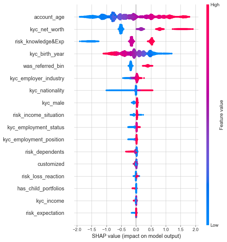
Features are sorted from top to bottom by the sum of the SHAP value magnitudes across all samples. Each dot represents an observation of a corresponding feature, stacked vertically when they share similar SHAP values to show density. The colour of each dot represents the feature value of that observation.
- Row orderTotal impact on the model, summed over every observation. Top row matters most overall.
- One dotOne observation. Vertical stacking is density, not a second axis.
- HorizontalThe SHAP value: how far, and in which direction, that feature pushed that prediction.
- ColourThe feature’s own value for that observation, low to high.
In this example the kyc_employer_industry feature has more total model impact than kyc_nationality, but for those samples where nationality matters it has more impact than employer industry. In other words, nationality affects a few predictions by a large amount, while employer industry affects many predictions by a smaller amount.
What it actually said
Read top to bottom, the ranking on the synthetic run is tenure (account_age), then net worth, then self-reported financial knowledge, then age, then whether the client had themselves been referred. Everything below that collapses towards zero and is noise as far as I’m concerned.
The directions are the intuitive ones: longer-tenured, wealthier and more financially confident clients refer more. Age needs one moment of care, because the feature is kyc_birth_year and so runs backwards: the high (magenta) values sit on the negative side, meaning the younger clients push the prediction down, and it is the older ones who refer. Exactly the kind of sign flip that a WoE-encoded or raw numeric column will happily hand you if you read the colour axis without checking what the feature actually counts.
The one I found most satisfying is was_referred_bin sitting fifth. Referred clients go on to refer, which is the same “pay it forward” effect the two-proportion z-test had already found earlier in the notebook, arrived at by a completely independent route. When a hypothesis test and a tree ensemble agree on something, that is a good deal more convincing than either on its own.
What I’d bring to the next model
Read the fold spread before chasing the mean
Two cross-validations with the same average can mean completely different things; only the spread distinguishes them.
Compare the spread against the noise floor, not a made-up threshold
Fold std isn’t dimensionless: it scales with fold size and class balance, so no portable cutoff exists. Work out the sampling error you’d get from a perfectly stable model and compare against that.
Five folds barely estimate a standard deviation
The 95% interval on σ from five observations spans 0.6× to 2.9× what you measured. Treat the check as a smoke alarm for gross instability, not a precision instrument.
Let the goal set the stopping rule
For prediction, chase the score. For interpretation, stop when the feature ranking stabilises, which happens well before the metric peaks. Know which job you are doing.
Be suspicious of a good score
Above 0.85 on messy behavioural data is a reason to go hunting for leakage, not to celebrate. A boring number that agrees across CV and hold-out beats an impressive one that doesn’t.
Corroborate across methods
A hypothesis test and a tree ensemble independently agreeing on the “pay it forward” effect was worth more than either result alone. Look for the second route to the same finding.